A SIMPLE APPROACH TO GOOD DESIGN
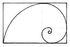
1. The Ideal Size. The most natural and pleasing size
ground upon which to draw or paint is a Golden
Rectangle, or a rectangle whose dimensions are 1 unit by
1.62 units.
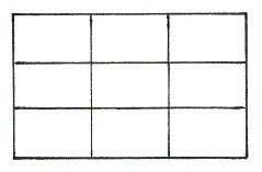
2. Divide the rectangle into thirds. This will aid us in locating the “sweet spots” in which to place the center of interest. Do not divide the picture into equal spaces. This is boring, and can lead to producing four pictures in one painting.
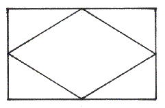
3. Lead the viewer’s eye around the composition by providing a path to follow, such as the one shown. The path you provide can vary from the one shown. It could be more oval, or another shape such as a pentagon. The path should connect with the top, bottom, and sides of the picture, and should provide an entrance to and an exit from the picture. The entrance is most often at the bottom of the painting. The exit you provide is an area that is progressively less important. A door, window or patch of sky can provide a place to “rest” the viewers' eye, a subtle exit. The path should, of course, lead to the center of interest. If the path begins to point out of the picture, adjust it accordingly, using a bending twig, a shimmer in the glass, a cloud, or whatever trick you might come up with to lead the viewers' eye back to the path.
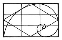
4. Putting the concepts together. These concepts will help us remember how to quickly adjust our picture for a good design, and help locate the center of interest in a pleasing location. Lightly draw these grids on your paper to help place your center of interest, and develop your pathways around the composition. Remember, one of the “sweet spots” must dominate, (Center of Interest).
5. Draw a grid, (like rectangle #2) on a 4” by 6.5” sheet of clear plastic or an overhead transparency sheet with a suitable marking pen. Use it to help locate the center of interest and pathways on your thumbnail sketches. Or, hold it up and view a scene through it. It should help you analyze the compositional elements of the scene.
1.
2.
3.
4.